PERSPECTIVE · EXPERIENCE DESIGN
Before You Design the Rooms, Design the Journey
What magic shows, dark rides and nearly a century of showmanship can teach us about pacing an experience
Many years ago, when I was working extensively with illusion shows, I wrote about a deceptively simple tool: a graph showing the flow of a show.
I recently found that old article again.
The drawing looked dated. The underlying idea did not.
A successful show is not simply a collection of good acts arranged one after another. It has rhythm. It accelerates and slows down. It creates anticipation. It delivers a payoff. It lets the audience recover and then starts building again.
It has peaks and valleys.
And the more I thought about that old graph, the more I realised that the principle reaches far beyond magic.
It applies to a circus. A musical. A children’s show. An immersive experience. A presentation. And, very clearly, to the design of a dark ride.
Perhaps the best name for it today is an Experience Pacing Curve.
It is a simple visual representation of a much more important question:
What should the audience be experiencing at this particular moment — compared with the moments before and after it?
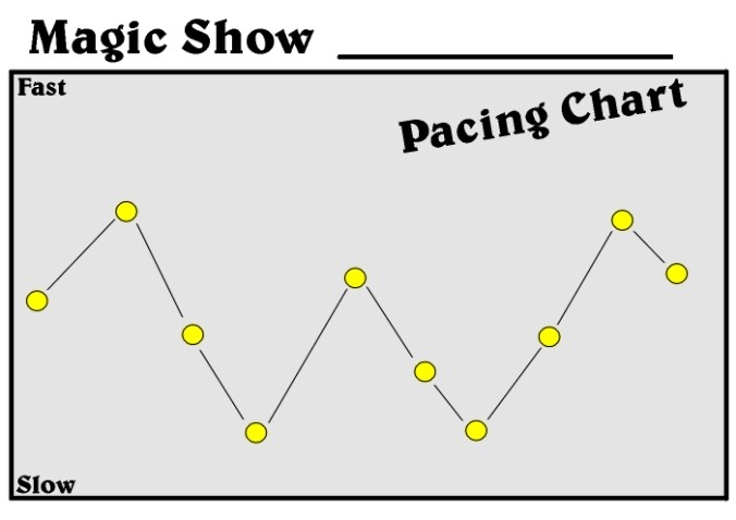
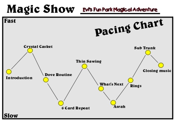
The old flow chart that started this train of thought again.
A show is not a list of acts
Imagine eight excellent circus acts.
Putting those eight acts in one order could produce a spectacular show.
Putting exactly the same acts in another order could produce a surprisingly mediocre one.
Nothing about the individual acts has changed.
What changed is the journey between them.
A spectacular aerial sequence feels very different after a quiet comic interlude than it does immediately after another spectacular aerial sequence.
A dramatic illusion can become much stronger if it follows something intimate.
Silence can make the next explosion seem louder.
Darkness can make the next reveal appear brighter.
A slow sequence can make the next burst of action seem considerably faster.
That gives us one of the central principles of pacing:
A valley is not necessarily a weak part of an experience.
Sometimes the valley is what creates the next peak.
If everything is presented at maximum intensity, the audience adapts.
Ten followed by ten followed by ten eventually stops feeling like ten.
You have not created a succession of peaks.
You have created a plateau.
Paul Osborne and the architecture of a twenty-minute illusion show
The old article I found was based on a particularly interesting example from American illusion designer and show producer Paul Osborne.
Osborne did considerably more than draw plans for illusion equipment. In the early 1970s he began supplying complete entertainment packages to amusement parks: performers, costumes, music, sets and shows. At one point his productions were operating in ten parks.
That distinction is important.
He wasn’t only asking:
How do I design a good illusion?
He also had to ask:
How do I make several illusions work together as one repeatable park show?
According to the material I saved years ago, Osborne arrived through years of trial and error at a basic structure for a roughly twenty-minute, three-person illusion show.
Individual illusions could be replaced from season to season.
The flow remained remarkably consistent.
That is what makes his approach so interesting.
The Osborne sequence
One example ran approximately like this:
1. Crystal Casket — 2:30
A fast production opening. The apparatus is assembled in view, covered and revolved, and a woman appears.
2. Dove / animal sequence — 1:00
Fast, visual and lighter. A dove production develops into another transformation.
3. Six Card Repeat — 2:00
The magician moves to the microphone. The scale becomes smaller and the tempo changes.
4. Thin Sawing in Half — 2:45
The production scale increases again. Assistants return, music becomes faster and a major illusion delivers the next peak.
5. What’s Next — 1:30
A smaller talking effect. Importantly, while the audience watches this, the next large illusion is being prepared backstage.
6. Asrah Levitation — 2:30
The tone changes completely. Ethereal music, levitation, disappearance and an unexpected reappearance from elsewhere in the theatre.
7. Linking Rings with audience volunteers — 3:00
Audience interaction changes the texture again. Meanwhile, backstage, the final illusion is prepared.
8. Substitution Trunk — 3:00
Up-tempo music, restraints, trunk, apparent impossibility and an extremely fast transposition provide the finale.
Those listed pieces total roughly 18 minutes and 15 seconds. The remaining time in a twenty-minute show accommodates introductions, bows, transitions and the small practical movements that connect everything.
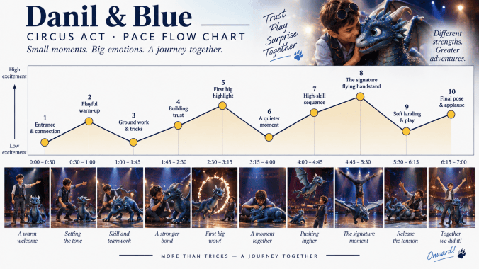
But look at what the sequence is actually doing.
It is not:
big illusion → big illusion → big illusion → big illusion.
It is closer to:
Strong opening → lighter visual sequence → smaller talking piece → major peak → reduction → atmospheric mystery → audience connection → maximum finale.
That is experience architecture.
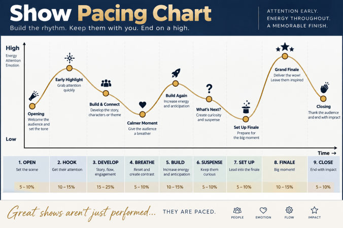
The individual effects can change. The underlying audience journey remains.
The slots matter more than the tricks
Perhaps the most useful part of Osborne’s approach was that he could substitute material without destroying the structure.
The Sawing could become a Zig Zag, Cutting in Sixths or another major illusion.
The Crystal Casket opening position could be occupied by a Costume Trunk, Doll House or Chef’s Nightmare.
The finale was more difficult because that position required something with the function of a finale.
The Substitution Trunk naturally works because its effect is fast, instantly understandable and culminates in a seemingly impossible exchange.
Osborne even developed alternatives such as his Chicago Fire illusion for that final slot.
The important lesson is that the question wasn’t merely:
What illusion could we put here?
It was:
What kind of experience does this position in the show require?
That is a fundamentally different way of designing.
And it is extraordinarily useful outside magic.
Dariel Fitzkee: timing, pacing, punch and contrast
Osborne’s practical park-show formula belongs to a much older body of thinking about showmanship.
One of the most important books in that tradition is Dariel Fitzkee’s Showmanship for Magicians, first published in 1943.
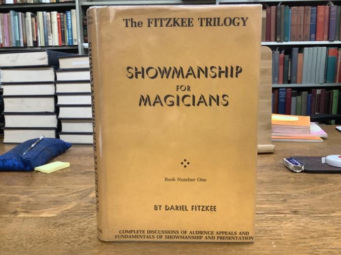
The table of contents alone is revealing.
Fitzkee devotes major sections to:
Rhythm
Timing and Pointing
Surprise
Unity
Physical Action
Economy and Brevity
Efficient Pacing
Punch
Spectacle
Contrast
Holding Attention
Routining
Putting an Act Together
This wasn’t a book primarily about learning more tricks. It was about turning tricks into entertainment.
And several of Fitzkee’s concepts map almost perfectly onto a pacing curve.
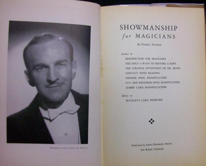
Dariel Fitzkee and Showmanship for Magicians. First published in 1943, the book treated magic not merely as a collection of tricks, but as entertainment that had to be timed, paced, structured and routined for an audience.
Timing
Timing is not simply speed.
It is the deliberate allocation and control of time.
When do we reveal something?
How long do we hold before the revelation?
How much time does the audience need to understand what has happened?
When should the performer accelerate?
When should the performer deliberately slow down?
A technically identical effect can produce a very different audience response merely because its timing changes.
That is why a pacing curve should never be interpreted as a vehicle speedometer or metronome.
Perceived pace is psychological.
Pointing
Fitzkee uses pointing in the theatrical sense: directing attention toward the moment that matters.
A performer doesn’t simply perform an action.
He prepares the audience to recognise:
This is important. Watch this.
Lighting can point.
Music can point.
A pause can point.
Body position can point.
A vehicle rotation in a dark ride can point.
Even an apparently empty corridor can point by removing every competing stimulus before a reveal.
Pacing tells us where the important moments sit in the journey.
Pointing helps the audience experience them as important.
Efficient pacing
Fitzkee describes efficient pacing as a performance in which unnecessary waits and dead spots have been removed, the audience’s interest does not sag, and the individual units receive the amount of time they require.
That does not mean everything must happen quickly.
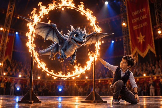
This distinction matters enormously.
A slow scene can be efficiently paced.
A quiet scene can be efficiently paced.
Even a long pause can be efficiently paced.
The question is whether the audience is waiting with anticipation or merely waiting.
Those are completely different experiences.
Punch
Fitzkee’s punch is the forceful impression that produces an involuntary positive reaction from an audience — the moment where preparation becomes payoff. He connects punch with movement, action, music, colour, spectacle and excitement.
On the pacing curve, punch is often represented by a peak.
But a peak without preparation has less force.
The graph therefore doesn’t simply tell us where the punch is.
It helps us design everything that allows that punch to land.
Contrast
This may be the concept that connects Fitzkee most directly to the flow chart.
Fitzkee explicitly argues for contrast as a method of emphasis: fast against slow, loud against soft, speech against silence. Variety helps sustain attention precisely because the experience is not uniform.
That is almost the theoretical explanation of the peaks and valleys on the graph.
The valley and peak are not competing with each other.
They are creating each other.
Without darkness, brightness has less impact.
Without silence, loudness loses scale.
Without restraint, spectacle becomes ordinary.
Routining: from tricks to an experience
Fitzkee also makes an important distinction between having material and routining material.
The trick itself is only raw material.
The arrangement gives it meaning.
The same applies one level higher.
A show is not created merely by selecting good acts.
Those acts have to be arranged into something that has direction, variation and progression.
Fitzkee describes performance in terms of opening, development and climax and repeatedly stresses the need to construct rather than merely accumulate material.
That is exactly what the pacing curve allows us to see.
Jeff McBride and the Seven Stages of Show Flow
Many decades later, illusionist and master manipulator Jeff McBride developed another useful framework: the Seven Stages of Show Flow.
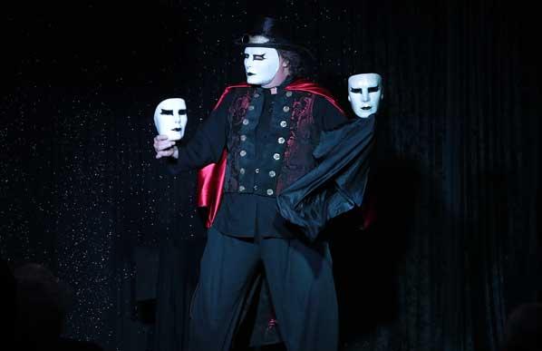
McBride is particularly known for highly visual manipulation — masks, cards and other objects — but his approach to constructing a complete performance goes far beyond manipulative skill.
His own description of the method emphasises grabbing attention, telling a personal story, audience interaction, transitions between effects and building toward an ending strong enough to get the audience on its feet.
One published academic analysis lists the structure as:
Preshow
1. Entrance
2. Welcoming
3. Feature
4. Audience Participation
5. Storytelling
6. Big Vision
7. Bows / Finale
This is not the same structure as Osborne’s twenty-minute park show.
Nor should it be.
Different performers, venues and audiences require different curves.
McBride himself notes that his performances are adapted to venue and audience; a casino showroom requires a different pace and theme from a theatre, festival or international engagement.
The interesting point is the common underlying principle:
Don’t think only about individual routines. Think about the journey through them.
Larry Hass: draw the energy on paper
Philosopher, magician and educator Larry Hass took this idea one step closer to the literal pacing curve.
In a 2013 M-U-M Magazine article analysing a performance by Jeff and Abigail McBride, Hass described the extraordinary changes in energy, rhythm, audience involvement, comedy, character and spectacle across the show.
Then he suggested something wonderfully simple:
Take a piece of paper and chart the energy of every piece as the show unfolds.
Look at where the curve starts.
Notice the changes in dynamics through the middle.
Then watch how the energy builds toward the ending.
That is essentially the exercise represented by the graph I had saved all those years ago.
And it makes something subjective discussable.
Instead of saying:
“The middle feels a bit flat.”
you can ask:
“Are we intentionally taking the audience from 7 down to 4 here?”
Instead of:
“Could we make this part bigger?”
you can ask:
“Should this moment actually be bigger than the one that follows?”
Those are much better creative conversations.
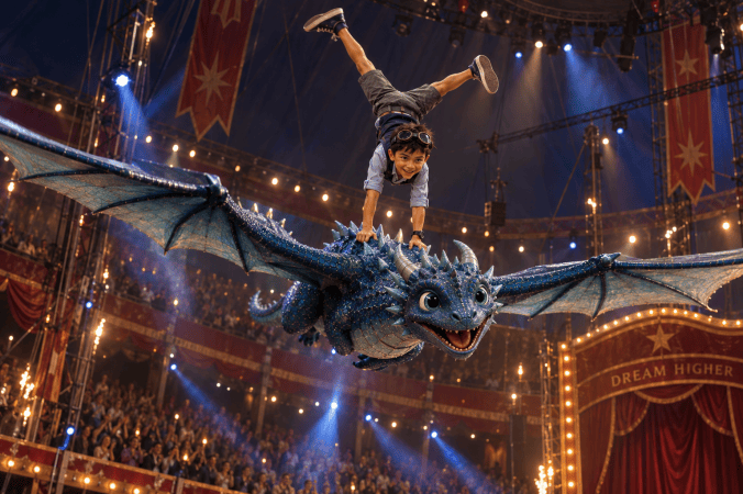
The peak is not created only by what happens here. It is also created by everything that happened before it.
From the stage to the dark ride
This is where the idea becomes particularly interesting to me.
A dark ride faces essentially the same problem as a show.
There is a beginning.
There is a sequence of scenes.
The audience moves through them in a predetermined order.
Certain information has to be understood before later events make sense.
Some moments should surprise.
Some should create wonder.
Some should generate tension.
Some should provide relief.
And eventually there should be a payoff.
But a dark ride adds another dimension:
the audience itself physically travels through the sequence.
The show has become architecture.
Was there historically a “flow chart” for dark rides?
Not exactly — at least not under one consistent name that I have been able to find.
What does exist is a fascinating history of increasingly sophisticated ways to visualise the sequence of a ride before building it.
And that history leads very naturally to the Experience Pacing Curve.
1920s: first design the path
An important step in the development of the modern dark ride came in 1928, when Leon Cassidy and Marvin Rempfer developed what became known as the Pretzel ride.
Its defining innovation was an electrically powered vehicle following a winding single rail through a dark building. The Pretzel Amusement Ride Company subsequently became one of the major suppliers of early American dark rides.
The design documentation was, understandably, heavily concerned with the physical path.
Former company president Bill Cassidy recalled the office where track layouts were literally drawn on graph paper.
That is an early form of ride-flow thinking.
The question was primarily spatial:
Where does the vehicle go?
Turns and stunts were positioned along that path to keep riders uncertain about what would happen next. Surviving Pretzel layouts and descriptions show how route geometry and gag placement were integral to the ride experience.
But something important was still missing.
A path tells you where the audience travels.
It doesn’t necessarily tell you what story or emotional sequence they travel through.
1950s: Disney brings the storyboard into the ride
The development of Disneyland changed that relationship dramatically.
Disney’s early Imagineers came largely from film production, animation, architecture and theatrical design.
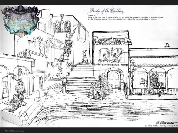
Pirates of the Caribbean – designing the scene from the guest’s point of view
Early attraction artwork shows how a dark-ride scene is composed as an experience: characters, action, scenery and sightlines are arranged so that the guest encounters the story in a controlled sequence. The drawing is not merely illustrating a room – it is designing what the audience will notice, and when.
For the original Fantasyland dark rides – including Mr. Toad’s Wild Ride, Peter Pan’s Flight and Snow White and Her Adventures – artists such as Ken Anderson and Claude Coats translated animated-film storytelling into physical environments, while Bill Martin worked the attractions into their ride layouts.
The critical tool brought with them from animation was the storyboard.
Instead of looking only at a floor plan, the design team could look at the attraction as a sequence of moments.
Scene.
Scene.
Scene.
Transition.
Reveal.
Another scene.
And eventually an ending.
Academic analysis of Disney’s design approach notes that storyboarding became particularly important for dark rides because designers were effectively converting cinematic sequencing into spatial sequencing: the guest moved through a carefully edited succession of scenes rather than watching those scenes pass on a screen.
John Hench later described the purpose beautifully: storyboards allowed Imagineers to design sequences of experiences leading guests toward peak moments.
That is extraordinarily close to the purpose of an Experience Pacing Curve.
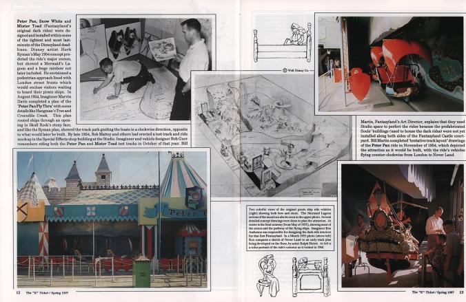
Peter Pan’s Flight — when the storyboard becomes a ride layout
Early planning for Peter Pan’s Flight translates a sequence of story moments into physical space. Scenes, track direction, transitions and sightlines have to work together so that the guest experiences the story in the intended order. In a dark ride, narrative eventually has to become geometry.
Disney’s early dark rides show how storyboarding evolved when storytelling became spatial. A film storyboard asks what the audience sees next. A dark-ride storyboard has to answer an additional question: where must the guest physically be for that moment to work? Haunted Mansion development sketches show individual story moments taking shape long before the finished attraction, while early Peter Pan plans translate the sequence directly into ride geometry, scenes and sightlines. In a dark ride, the storyboard eventually has to become architecture.
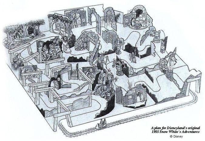
Snow White’s Scary Adventures — story told through rooms, turns and reveals
This early attraction layout shows how individual scenes are connected through the physical path of the ride. Each turn determines what the guest can see next, turning the floor plan itself into part of the storytelling. The route is therefore more than transportation between scenes: it controls anticipation, surprise and pacing.
From storyboard to ride layout
The storyboard answers:
What happens next?
The floor plan answers:
Where does it happen?
The ride layout then has to reconcile the two.
That sounds obvious today, but it represented an important convergence of disciplines.
A sequence that worked beautifully on paper might not physically fit inside the building.
A scene that required thirty seconds might occupy a section of track the vehicle crossed in twelve.
A reveal might fail because riders could see it too early.
A sightline might expose the next room.
The physical architecture therefore had to support the dramatic sequence.
This is one of the characteristics that makes dark-ride design so interesting.
Story has geometry.
1960s and 1970s: increasingly sophisticated layouts
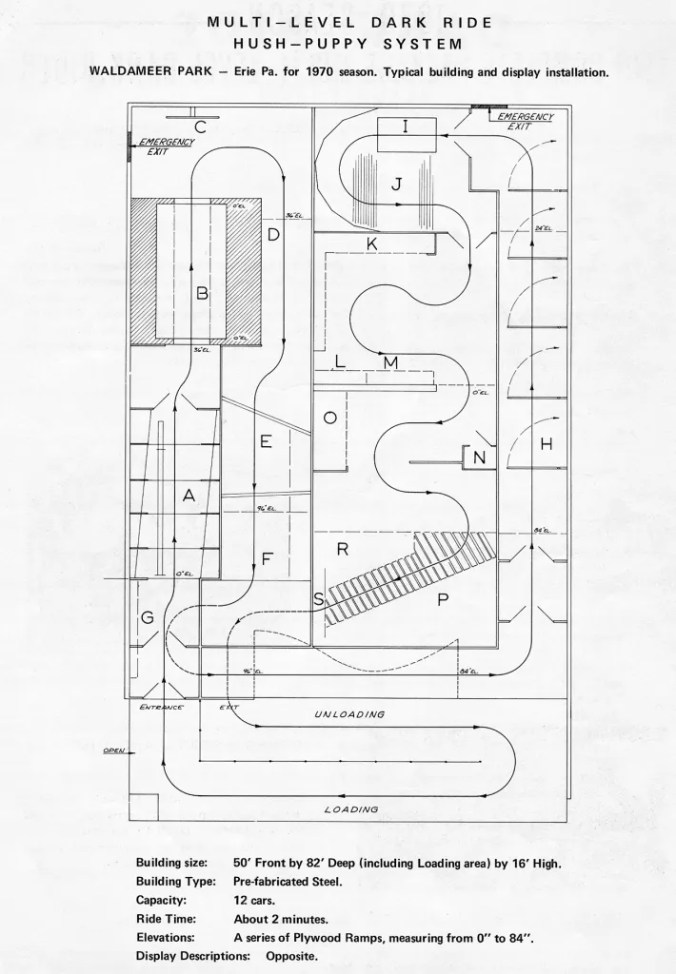
Design records from dark-ride creator Bill Tracy provide another fascinating historical snapshot.
Surviving drawings include detailed layouts for attractions such as the multi-level Whacky Shack at Waldameer Park from 1970 and a two-story packaged Haunted House from 1964.
Again, the document is primarily a spatial plan.
But by this stage a dark ride is clearly being treated as a designed sequence of rooms, effects, transitions and movement through a controlled environment.
The ride layout is becoming the physical skeleton of the experience.
Storyboard first, building second
That principle remains visible in contemporary attraction development.
A dark-ride design team interviewed by Dark Ride Database described starting with the story, dividing it into sections and creating storyboards showing what would happen from beginning to end.
Only after the sequence was agreed did they consolidate moments into scenes, determine which rooms needed to be large or small, estimate an eight-minute ride time and translate the storyboard into a building.
That sequence makes enormous sense:
Story → rundown → storyboard → scenes → layout → building
rather than:
Building → rooms → now what can we put in them?
Modern attractions add timing and motion
Today the process can go considerably further.
Previsualization allows designers to experience scenes long before physical construction.
Ride timing can be analysed almost to the second.
Vehicle orientation can be choreographed so guests are looking in exactly the correct direction when an effect happens.
Show action, audio, lighting, media, animatronics and special effects can all be synchronized around the guest’s arrival.
For example, work on Secret Life of Pets: Off the Leash included designing vehicle rotation profiles specifically so that sightlines and reveals aligned with scene action. Other attraction work explicitly includes show timing, previsualization, show sequencing, trigger timing and special-effect intensity.
Behind-the-scenes material for Shanghai Disneyland’s Pirates of the Caribbean: Battle for the Sunken Treasure similarly documents attraction storyboards, ride timing, ride layouts, previsualization, models and show-control development as interconnected parts of the design process.
So the historical progression looks approximately like this:
Track layout
↓
Stunt / scene placement
↓
Storyboard
↓
Scene-by-scene rundown
↓
Ride layout + timing
↓
Previsualization
↓
Show sequencing + vehicle choreography
↓
Integrated attraction programming
And I think there is room for one more explicit layer:
The Experience Pacing Curve
Because none of those documents necessarily answers, on its own:
How intense should this moment feel compared with every other moment?
Start with the room rundown
For a dark ride, I would start with something intentionally simple.
Before detailing every animatronic, screen or special effect, create a rundown.
For example:
| Scene | What happens | Intended guest response | Energy |
|---|---|---|---|
| Load | Enter the story world | Curiosity | 2 |
| First reveal | Discover the environment | Wonder | 5 |
| Character encounter | Understand the mission | Engagement | 4 |
| First threat | Something goes wrong | Tension | 7 |
| Dark passage | Very little happens | Suspense | 3 |
| Chase | Major action | Excitement | 8 |
| False safety | Threat seems over | Relief | 4 |
| Finale | Major confrontation | Maximum excitement | 10 |
| Resolution | Conflict resolves | Satisfaction | 6 |
| Unload | Final image or joke | Closure | 3 |
Now plot those numbers.
Suddenly you can see the shape of the attraction before most of the detailed design exists.
The spectacular plateau
Imagine somebody proposes this sequence:
Room 1 — enormous projection
Room 2 — monster attack
Room 3 — explosion
Room 4 — chase
Room 5 — giant animatronic
Room 6 — enormous finale
Everyone around the table could be enthusiastic.
Every room sounds spectacular.
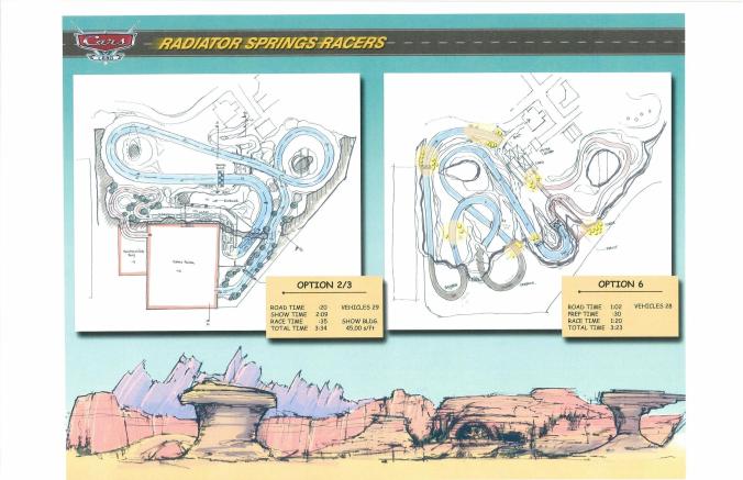
Radiator Springs Racers – when layout and timing become one design problem.
The physical route determines more than where the vehicle travels. Show duration, scene timing, transitions and vehicle movement all have to support the intended experience. Modern previsualisation allows these relationships to be tested before the attraction is built.
Then you draw the curve:
9 → 10 → 9 → 10 → 9 → 10
And immediately the problem becomes visible.
There are no meaningful peaks.
There is a plateau.
Now compare:
4 → 7 → 3 → 8 → 4 → 10
The finale has not necessarily become more expensive.
But it can feel much bigger.
Because contrast has created perceived intensity.
Fitzkee would recognise that principle immediately.
So would Osborne.
And so would McBride.
A quiet scene can contain enormous energy
We also have to be careful about what the vertical axis means.
It should not simply say:
FAST ↕ SLOW
because audience intensity and physical speed are not the same thing.
Consider a dark-ride scene where:
Vehicle movement = 2/10
Visual spectacle = 2/10
Sound level = 1/10
but:
Story tension = 9/10
The vehicle is almost stationary.
The room is dark.
The music has disappeared.
Something can be heard somewhere ahead.
Nothing happens.
Nothing happens.
Still nothing happens.
And the audience is completely engaged.
Then—
BANG.
The physical action jumps from 2 to 9.
The quiet scene was not a low-value scene.
It was storing energy.
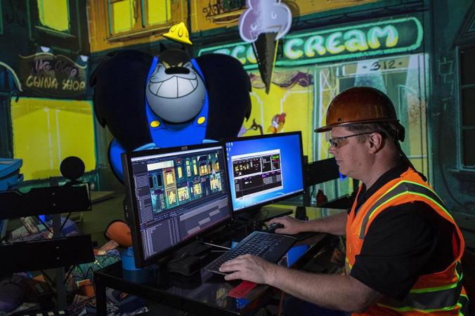
The final curve has to become a programmed experience.
In a modern dark ride, story, vehicle movement, media, lighting, sound and physical effects are precisely coordinated. What began as a sequence of ideas ultimately becomes show control: hundreds of individual technical actions working together so the guest experiences one coherent journey.
The valley can also be working backstage
Magic shows reveal another useful principle.
In Osborne’s structure, the audience might be watching a relatively small effect while assistants are frantically preparing the next large illusion backstage.
The same can happen in an attraction.
From the guest’s perspective:
Energy ↓
Behind the scenes:
Technical activity ↑
A restrained transition can provide time for:
vehicle spacing,
scene reset,
doors,
show-action equipment,
media synchronization,
animatronic cycling,
lighting adaptation,
or simply moving the guest into the correct physical position for the next reveal.
That means the pacing curve can eventually sit above a second technical timeline.
Audience experience
and
production activity
do not necessarily rise and fall together.
One curve can become several
As design development progresses, one Experience Pacing Curve can develop into several parallel tracks.
For example:
Audience energy
Story tension
Physical movement
Visual spectacle
Information density
Humour
Interaction
Music intensity
Technical complexity
That creates a much richer picture.
And the curves should not all be identical.
If every discipline peaks simultaneously in every scene, the experience will probably become exhausting.
Sometimes music needs to disappear while tension increases.
Sometimes physical movement should decrease while story intensity rises.
Sometimes a visually spectacular room needs very little narrative information so the audience has time to absorb what it sees.
The curves can become a method of orchestrating disciplines.
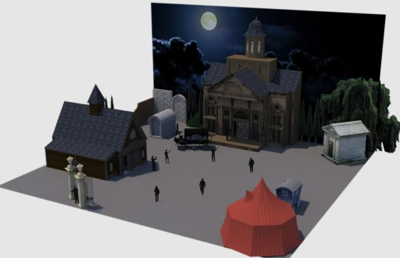
From story concept to spatial sequence.
This Walt Disney Imagineering Imaginations competition concept shows how themed environments can be organised around a trackless ride system. Once the story moments are placed in physical space, their order, duration and transitions begin to define the rhythm of the guest journey.
(https://www.taylorabaird.com/disney-imaginations)
Keep the curve alive during design development
For me, this is perhaps the most useful part of the method.
The pacing curve should not be a nice concept-design diagram that disappears once the real work starts.
It should remain a reference throughout development.
Suppose Scene 5 has intentionally been defined as a restrained suspense moment at Energy 3.
Then someone proposes:
“Could we add another projection here?”
Perhaps.
But the first question becomes:
Does that strengthen the intended position of Scene 5 in the whole attraction?
The composer wants stronger music.
The lighting designer wants more movement.
The media team wants another screen.
The special-effects team has discovered a fantastic new effect.
The ride programmer wants to accelerate the vehicle.
Each idea might be excellent in isolation.
But individually excellent ideas can collectively destroy the experience.
The curve allows the creative director to say:
“No. This moment is supposed to be quiet.”
Not because nothing interesting should happen there.
But because something more important is about to happen next.
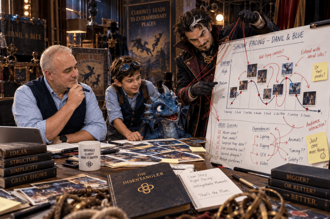
Every complex project eventually develops a strong desire to add “just one more thing”. Lucien is particularly enthusiastic about this stage.
It can even become a scope-management tool
This is where the tool begins to move beyond storytelling.
Attraction projects have a natural tendency to accumulate.
One more effect.
One more character.
One more screen.
One more interactive element.
One more technological possibility.
One more spectacular moment.
There is always a good argument for adding something.
So ask:
Where does this idea belong on the curve?
Does it strengthen the intended moment?
Does it create a missing transition?
Does it reinforce the build?
Does it improve the climax?
Or does it simply make another room bigger and busier?
If the answer is:
“It doesn’t really have a role, but it would be cool…”
that is useful information.
A pacing curve therefore becomes not only a creative tool.
It can become a decision-making and scope-control tool.
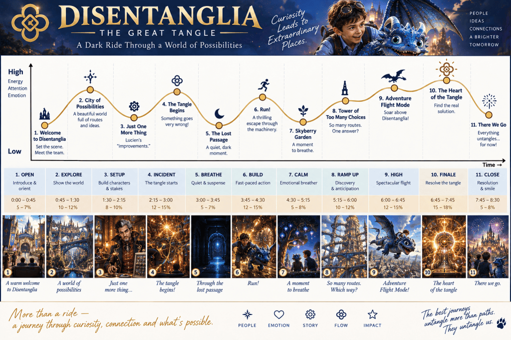
From a magic graph to experience architecture
What I like most about rediscovering that old magic-show diagram is how much larger the idea becomes when you follow it.
Paul Osborne used a repeatable structure to make different illusion shows work.
Dariel Fitzkee explained why timing, punch, pacing and contrast affect an audience.
Jeff McBride developed a structure for transforming individual routines into a complete magical experience.
Larry Hass suggested simply drawing the changing energy of that experience on paper.
Early dark-ride designers drew vehicle paths.
Disney’s Imagineers brought cinematic storyboarding into physical experience design.
Modern attraction teams add timing, previsualization, vehicle choreography, show sequencing and control programming.
They are all tackling variations of essentially the same problem:
How do separate moments become one experience?
And that is why a simple line on a graph can remain useful even inside an extraordinarily complicated project.
A dark ride may involve architecture, ride engineering, media, scenery, lighting, audio, animatronics, show control, special effects, software, safety systems and operations.
But the guest doesn’t experience those disciplines separately.
The guest experiences:
Curiosity → wonder → tension → relief → discovery → danger → anticipation → payoff → resolution.
So before designing every room, every effect and every technical system:
Design the journey.
Because a memorable attraction is not simply a collection of impressive scenes.
It is the carefully designed flow between them.
Selected references
Dariel Fitzkee — Showmanship for Magicians, originally published in 1943. The book covers timing, pointing, efficient pacing, punch, spectacle, contrast, holding attention, routining and act construction.
Paul Osborne / Illusion Systems. Osborne’s career included designing, building and producing complete illusion entertainment for theme parks; contemporary profiles document his early amusement-park show business and extensive illusion-design work.
Jeff McBride — Seven Stages of Show Flow. McBride describes the system as a method for transforming individual effects into a complete performance, including attention, story, participation, transitions and finale construction.
Larry Hass — “Building a Show,” M-U-M Magazine, November 2013. Hass analyses a McBride performance and explicitly invites readers to chart the changing energy of the show on paper.
John Hench / Disney Imagineering. Hench’s design thinking emphasised storyboarding experiences and arranging sequences that lead guests toward peak moments.
Early dark-ride design / Pretzel Amusement Ride Company. Surviving historical material documents Pretzel track layouts, including layouts drawn on graph paper, illustrating the early importance of visually planning the path through the attraction.
Disneyland Fantasyland dark rides. Ken Anderson, Claude Coats and Bill Martin translated animation, storyboards, scenic design and track layout into physical ride sequences for Disneyland’s original Fantasyland dark rides.
Bill Tracy Project. Surviving 1960s and 1970s professional dark-ride layouts document the increasingly sophisticated spatial planning of complete rides and walk-through attractions.
Contemporary attraction development. Current industry practice includes storyboards, scene breakdowns, ride timing, previsualization, vehicle motion profiles and show sequencing, extending the same visual-sequencing principle into digital design and show programming.
 The Disentangler